page top


F
P
Oct 04, 2025
Oct 04, 2025
記憶、観察、そして絵画や映画、写真など多岐にわたるイメージのリサーチを編集し再構成することを制作の起点とし、没入的な情景を生み出す中村翔大。故郷である山梨県の山々や、ベルリンの公園や運河での日々の散歩からインスピレーションを得る絵画作品の多くは、自然、室内、庭園、眠る人物といった、美術史において繰り返し描かれてきた主題が描かれている。ボナールの色彩、マティスの空間表現に影響を受けながらも、中村の描く庭はポスト印象派の絵画に描かれた庭の親密で楽園的なイメージとは対照的に、室内と屋外、夢と日常的な空間、意識と無意識、安らぎと不安、美しさと不気味さといった境界が曖昧に溶け合う「開かれた」空間として描かれ、瞑想的な静けさをたたえると同時に夢の中で不条理が不意に現れてくるような気配を帯びている。現在、「グレー」の色相への関心を反映する油彩作品の個展「青と緑」(タカ・イシイギャラリー 京橋)、水彩作品の初発表となる個展「オリエント」(タカ・イシイギャラリー 六本木)の2つの個展を同時開催中の中村に、2025年8月、ポーラ美術館の主任学芸員 鈴木幸太氏がインタビューを実施。制作の着想をめぐる対話が実現した(タカ・イシイギャラリーでの個展は11月1日[土]まで開催中)。
Shota Nakamura creates immersive scenes from memory, observation, and research on images derived from painting, film, photography, and other sources, which he edits and reconstructs in his works. Many of his paintings, inspired by the mountains of his native Yamanashi and his daily walks through Berlin’s parks and canals, revisit subjects that recur throughout art history, such as nature, interiors, gardens, and sleeping figures. While influenced by Bonnard’s palette and Matisse’s sense of space, Nakamura paints gardens not as the intimate, idyllic spaces seen in Post-Impressionist painting, but as open spaces where boundaries blur, between indoors and outdoors, dream and everyday life, conscious and unconscious, calm and anxiety, the beautiful and the eerie. These spaces are imbued with a meditative stillness while hinting at the sudden appearance of absurdity, as in a dream. In August 2025, Kota Suzuki, Senior Curator at the Pola Museum of Art, interviewed Nakamura, who currently has two simultaneous solo exhibitions: Blue and Green at Taka Ishii Gallery Kyobashi, featuring oil paintings exploring subtle hues of gray, and Orient at Taka Ishii Gallery Roppongi, his first exhibition of watercolors. Their conversation explores the inspirations that drive his process. Both exhibitions are on view at Taka Ishii Gallery through Saturday, November 1.

中村翔大「Nude in a Wood (after Henri Matisse)」2025年、キャンバスに油彩、91.8 x 71.8 cm. ©︎ Shota Nakamura Photo: Kenji Takahashi
Shota Nakamura “Nude in a Wood (after Henri Matisse)” 2025, oil on canvas、91.8 x 71.8 cm. ©︎ Shota Nakamura Photo: Kenji Takahashi
鈴木 山梨時代のお話から伺ってもいいですか。どんな子供時代だったのでしょう?
中村 子供の頃は山梨県の北杜市の大泉村で過ごしました。車がないとどこにも行けない生活で、コンビニまでも30分かかるような場所でした。90年代初めの頃で清里がブームだったこともあって、うちの両親も田舎でレストランをしたいと、僕が1歳ぐらいのときに引っ越しました。父は昔アメリカのアトランタに住んでいたらしいです。だから「アトランタ」という名前のレストランを経営していました。
鈴木 素敵ですね。どのあたりから美大を目指し始めたんですか?
中村 父が映画好きだったことがきっかけで、僕も映画を沢山観るようになり、「世界って面白いな」と感じるようになりました。山梨から東京の渋谷にある映画館に足を運ぶこともあり、映画を通してさまざまな興味が広がったように思います。環境にも恵まれていて、北杜市には個人経営のペンションやレストランが数多くありました。同級生のお父さんが器を作っていたり、絵を描いていたりする人が大勢いて、そうした環境も美術に触れるきっかけとして大きかったんじゃないかと思います。
鈴木 2012年にベルリンに移住されてから13年が経ちました。どのような心境の変化や、出会いがあったのでしょう?
中村 ベルリンに来た当初は、移民であることも加えて言語の壁も本当に大きかったし、その環境で自分が本当にできることはなんだろうと考えていました。そうやって、迷ったり悔しい思いをしながら絵を続けていくなかで、ベルリンという都市を選んで移住してくる違う国のアーティストたちと出会って共鳴する感覚があったことは大きかったです。とくに覚えているのは、2018年に初めてニューヨークに行ったんですけど、インスタグラムで繋がっていた画家のルイス·フラティーノのスタジオに初めて行ったときに、自分が移住して以来初めて、絵の話を熱心にしているということに気がついたんです。人種や移民であるという自分の出自についての話より先に、絵について純粋に話せたんです。自分も話していいんだなと思えたきっかけでした。ルイスのような同世代の作家との出会いは大きいですね。
Kota Suzuki I’d like to start by asking about your time in Yamanashi. What was your childhood like?
Shota Nakamura I grew up in a village called Oizumi, which is now part of Hokuto City in Yamanashi Prefecture. You couldn’t get anywhere without a car, and it was about a 30-minute drive just to the nearest convenience store. This was the early 90s, when the Kiyosato area of Yamanashi was really popular as a vacation spot, and my parents wanted to open a restaurant in the countryside, so they moved there when I was about a year old. My father had lived in Atlanta, Georgia, so they named the restaurant Atlanta.
KS That sounds wonderful. When did you start thinking about going to art school?
SN My dad was really into movies, so I ended up watching a lot too. What I saw made me realize how interesting the world could be. Sometimes I’d even go all the way from Yamanashi to theaters in Shibuya to see films, and through that my interests just kept expanding. The area I grew up in also helped. Hokuto was a place with lots of small family-run inns and restaurants, and many of my classmates’ fathers were potters or painters. Being in that environment played a big role in how I first got into art.
KS It’s been 13 years since you moved to Berlin in 2012. How has your perspective changed, and what kinds of encounters have you had along the way?
SN When I first got here, being an immigrant, and what’s more not speaking the language, felt overwhelming, and I kept wondering what I could really accomplish in that situation. But I kept painting through all the confusion and frustration, and when I met other artists from different countries who had also chosen to relocate to Berlin, I felt a real sense of connection with them that was really meaningful for me. One thing that really stands out was my first trip to New York in 2018. I visited the studio of Louis Fratino, a painter I’d connected with on Instagram. That was the first time since leaving Japan that I found myself talking about painting with real passion. I was able to talk about painting itself, and put it ahead of any issues of race or being an immigrant. It made me realize that I, too, had a right to speak my mind. Meeting painters of my own generation like Louis was really important for me.
鈴木 ヨーロッパで、多くの先人達の作品に触れながらそれらを深く研究されていらっしゃいます。ボナール、マティス、ヴュイヤールなどは、近年の中村さんの作品への影響として度々指摘される近代の作家たちですが、その影響関係を指摘するだけではあまりにいろいろなものを見落としてしまいそうです。スタイルの類似性よりも、それぞれの作家をどのように中村さんが捉えているかに興味があります。たとえばボナールは、中村さんにとってどのような作家でしょうか?
中村 ボナールの絵で最初に目に入ってくるのは、やはり光だなと思っていて、筆触が作る光、筆触の向きから光の方向、あるいは筆触が描かれるときにブラシが立てる音まで想像しながら絵を観ていると、主題もしくはイメージが地に引っ込んでいくような感覚があります。そのときに初めて気づくのは、ボナールという人は主題や物語よりも、雰囲気もしくは光の状態を絵画で実践することに最も価値を置いていたのだなということでした。実は、僕は主題を探すのがとても苦手で、なにを描いたらいいのかわからないという気持ちが昔からあるのですが、ボナールの作品を観て主題はなんでもいいのだということに気づかされました。彼の作品を観るときに主題を探そうとするのですが、描かれた人物や物との関係によって距離というものが描かれていながらも、それらがとくに相互に作用しているようには見えず、目が全体を回るような、目が絵の中で遊ぶような感覚がとても印象に残ります。目がひとつの場所に留まらないように、絵の中に明確な中心がない。すべてが平等に扱われていて、それぞれの要素の関係によって絵の中に空間が作り出されている。キャンバス全体を見渡したときに満足感が得られる稀有な作家だと思います。
KS In Europe you’ve spent a lot of time studying earlier artists and seeing their work in person. Bonnard, Matisse, and Vuillard are frequently pointed to as modern painters who have affected your recent practice, but focusing only on influence feels reductive and risks neglecting essential points. More than stylistic similarities, I’m interested in your interpretations of each of them. For example, what does Bonnard mean to you?
SN The first thing I notice in Bonnard’s paintings is the light. I look at the way the brushstrokes themselves create light, how their direction suggests where the light is coming from, and I even find myself imagining the sound of the brush moving across the surface. Then, it feels as if the subject or image sinks back and dissolves into the painted surface. Seeing it that way, it struck me that what Bonnard valued most wasn’t subject matter or narrative, but atmosphere and the condition of light itself. I often find it hard to decide on subjects, I’ve always felt like I don’t know what to paint, but looking at Bonnard made me realize the subject could be anything. When I search for the subject in his work, I notice that while the relationships between figures and objects imply distance, they don’t really seem to be interacting. Instead, my eyes keep moving across the whole surface, almost playing around within the painting. My gaze doesn’t settle in one place because there’s no clear center. Everything is treated equally, and space emerges through the relationships between all the elements. He’s one of the rare artists whose paintings really feel complete when you step back and take in the entire canvas.
鈴木 マティスについてはどうでしょう? 例えばこの作品「Untitled」(2022年)や、新作の「Goldfish by the Window」には、マティスからの極めて意図的な引用があります。
KS How about Matisse? For instance, your 2022 work Untitled and your new work Goldfish by the Window seem to contain very deliberate references to him.
中村翔大「Untitled」2022年、ボードに油彩、30 x 24 cm ©︎ Shota Nakamura
Shota Nakamura “Untitled” 2022, oil on board, 30 x 24 cm. ©︎ Shota Nakamura
中村翔大「Goldfish by the Window」2025年、キャンバスに油彩、180 x 130 cm. ©︎ Shota Nakamura Photo: Kenji Takahashi
Shota Nakamura “Goldfish by the Window” 2025, oil on canvas, 180 x 130 cm. ©︎ Shota Nakamura Photo: Kenji Takahashi
中村 今回の油彩の展覧会「青と緑」で描かれた室内画は、マティスがフランスのニースで描いた1916年から1930年頃の作品を参照しています。先ほど、主題を設定することが自分にとって難しいと話しましたが、彼のニース時代の作品では、物語や人間の情動、感情よりも、置かれている物同士の距離関係が即物的に描かれています。花や椅子、テーブルの上の果実、そして窓と、その窓の外に広がる海。物語を排し、即物的に世界を捉える態度はとても参考になりました。
SN The interiors I painted for the exhibition Blue and Green draw on Matisse’s works from his years in Nice, roughly between 1916 and 1930. I mentioned earlier how choosing subjects is something I struggle with, but in Matisse’s paintings from the Nice period, relationships between objects are depicted very plainly, not relying so much on narrative or emotion. He shows us flowers and chairs, fruit on a table, a window, the sea beyond it. That approach, stripping away narrative and depicting the world as it is, was something I learned a lot from.
中村翔大「Studio」2025年、キャンバスに油彩、120 x 150 cm. ©︎ Shota Nakamura Photo: Kenji Takahashi
Shota Nakamura “Studio” 2025, oil on canvas, 120 x 150 cm. ©︎ Shota Nakamura Photo: Kenji Takahashi
鈴木 オラミジュ・ファジェミシンは「夢の庭」と題したエッセイ注の中で、中村さんの作品の静謐な構図、色彩の激しい衝突、「叙情性、退廃性、冷淡さ」あるいはエロティシズムについて語っています。主題が一旦保留されたとして、中村さんの絵は、どこから始まるのでしょう? スケッチですか? 写真ですか? 図版ですか? それとも夢のようなものでしょうか?
中村 自分の記憶、観察、そしてイメージのリサーチ、イメージソースはおもにこの3つなのですが、とくにイメージのリサーチが大事です。絵画や写真、映画、自分で撮った写真、Googleでオンライン上のピクセルになったイメージなど、多岐にわたるイメージを見返すなかで、あるイメージに出会う、発見する、そこから絵が発展していくということがよくあります。イメージそのものが自分の記憶を刺激したり、その絵自体が持っている実践の延長というか、その絵が実践しようとしていたことをもう一度自分の中に持ってきて僕なりの答えを出すようなアプローチをしているのかなと思います。
KS In her essay “Garden of Dreams,” note1 Olamiju Fajemisin remark on your meticulous and tranquil composition, the bold, unpredictable colorways, and the elements of sentimentality, devastation, indifference, and eroticism. If we put subject matter aside for a moment, where does your painting begin? With sketches, photos, images from books, or dreams?
SN From my memories, observations, and research on images. Those are the three main sources, but the image research is especially important. I look back through all kinds of images, from paintings, photographs, and films, to snapshots I’ve taken and pixelated images I find online, and sometimes I’ll come across something that sparks me. That encounter often becomes the starting point for a painting. An image might trigger a memory, or it might feel like a continuation of what I was already trying to do with a painting. My approach is to take the direction a painting was heading in, internalize it, and respond to it in my own way.
鈴木 今回の新作では、かなり大きな人体を描かれています。これまでの作品では男性像が多かったように思いますが、今回の作品は無性的ですね。ミケランジェロは、女性像であっても男性をモデルにしたものが多いといいますが、人体を描くときにモデルはいますか? 人体を扱うときに中村さんが考えていることを教えてください。
中村 モデルは写真だったり、自分だったりしますが、おもに自分です。僕は誰かのポートレートは描かないんです。個人に興味があって描くという肖像画家がいるとしたら、僕はそういう画家ではないと思います。ただ画家として人体を描きたいという欲望はあって、でも自分がその人体をどのように扱うかということはとても慎重に考えてきました。本を読んでいる、絵を描いている、もしくは寝ている人達を積極的に扱うのは、彼らの状態はなにかの没入の状態にいる、つまり精神自体はまったく違う場所にいる、そういった状態にある人間の身体のポーズだったり、そういう身体なら描けると思って。絵を観たときに、この人に没入したい、でもできない、弾かれる、ということが面白いなと思います。今回の新作については、なんとなくああいう形になっていったけれど、納得のいく人体像が描けたなとも思っています。あの絵自体のサイズが結構大きくて、だから対峙したときに人の気配、すごく大きな人間の威圧感があって、その時点で人が描けているなという感じがありました。同時にこの絵にはディテールは必要がないと判断しました。
KS In your new works you’re painting a quite large human figure. In earlier works the figures seemed mostly male, but this time it feels more androgynous. Michelangelo is said to have often used male models even for female subjects, but do you use models when painting the human figure? What is on your mind when you’re working with the figure?
SN Sometimes I paint people from photos, but mostly I use myself as a model. I’m not painting portraits of anyone in particular. Portrait painters may be driven by an interest in specific people, but I don’t think I’m that kind of painter. What I do have is the desire to paint the human figure, and I’ve spent a lot of time thinking carefully about how to approach it. I often paint people who are reading, painting, or sleeping because they’re in a state of immersion, their minds are somewhere else entirely, and the poses of figures in that state are ones I feel I can work with. When you see one of these paintings, you might want to enter into that immersion, but you can’t, you’re blocked from entering, and I find that tension interesting. With the new work, the figure gradually took shape in that way, and I felt I had managed to paint a convincing figure. The canvas itself is quite large, so when you stand in front of it there’s this overpowering physical presence, the sense of confronting a very large person. That alone made me feel I had succeeded in doing something with the figure, and at the same time I decided the painting didn’t need fine details.

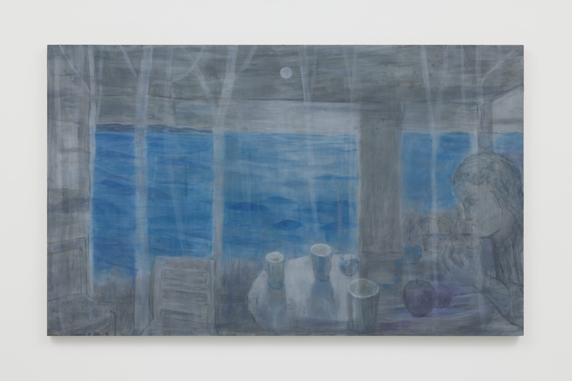
中村翔大「Blue and Green」2025年、キャンバスに油彩、180 x 120 cm. ©︎ Shota Nakamura Photo: Kenji Takahashi
Shota Nakamura “Blue and Green” 2025, oil on canvas, 180 x 120 cm. ©︎ Shota Nakamura Photo: Kenji Takahashi
鈴木 中村さんの制作は自伝的な性質もあるのでしょうか。
中村 僕、この質問はすごく面白いなと思って。自伝的な意識はあまりないのですが、たとえば絵の中に現れる人物に男性が多くなるのは、自分自身の身体や顔を一番目にしていますし、身近な身体は男性の身体だったりするので、どうしても登場してきます。「これはあなたなの?」と聞かれたときには「多分」みたいな答え方をすることがあります(笑)。イメージを見ることで想像力や記憶を刺激されることは、もちろん制作の出発点にはあるのですが、それを通してそのイメージが自分にもたらすものや、イメージが僕だけではなく他の人にもどういったことをもたらすのかということを考えています。その意味で自伝的というよりも、イメージが持っている作用そのものに興味があります。
KS Do you see your work as autobiographical?
SN That’s a really interesting question. I don’t really see my work as autobiographical, but for example, the reason so many figures in my paintings are male is simply because I see my own body and face most often. The body I’m most familiar with is a male body, so it naturally appears. When people ask me, “Is that you?” I sometimes say, “Maybe” (laughs). Images do trigger my imagination and memory, and that’s usually the starting point, but from there I think about what those images bring to me, and what they might bring to others as well. In that sense, it’s less about autobiography and more about an interest in the effects of the images themselves.
鈴木 多くの場合、中村さんの絵には支配的な色があります。黄色、赤褐色、深緑、紫やオレンジなど。ただしそれは、描く対象の固有色とは必ずしも関係のない形でレンダリングされているようです。色彩へのアプローチについて教えていただけますか。
KS In many of your works, a specific color tends to dominate, like yellow, reddish brown, deep green, purple, orange, and so on. But these colors are rendered in ways distinct from the subject’s natural hues. What can you say about your approach to color?

中村 色彩を扱うことはやはり光を扱うことだなと強く思うんです。絵の具を練り上げてキャンバスに塗って、光を作っていく作業が絵画だと思うんです。その光のトーナリティ——どのようなトーンをもって空間を構築するのか——にもっとも関心があり、近年は色彩を通して「自分のトーンはどこにあるのか」ということについて考え続けています。今回の展覧会「青と緑」は、グレーやベージュのような灰色の色相の中にある微妙な色の揺れ、たとえば隣接する色によってグレーという色は転びやすい色だなと感じていて、その微妙な色のその違い、揺れみたいなものを今回の展覧会でどういう風に追求できるかなと考えました。僕はヴァージニア·ウルフが好きで、ウルフの小説に『青と緑』という短編があるんです。「青と緑」という展覧会のタイトルはそこから引用しました。この短編は見開き1ページで緑の章と青の章があるのですが、非常に抽象的で詩的な表現に満ちていて、自分なりの解釈でしか語れませんが、おそらく青と緑は光の影の色なんだと思います。緑は日中ガラスを通して見える光の緑、そして夜あるいは早朝になった時に最初に目が感じる色としての青。「あ、これは自分の考えていたトーナリティと色相についての言葉だ」と思ったんです。これまで黄色や褐色系の色をこれまで積極的に使ってきましたが、今度は青と緑を影にしたグレーの淡いトーンを今回の展覧会で表現したいと思って「青と緑」というタイトルをつけました。絵について考えるときに、言語とイメージの関係性については詩の中で繰り返し扱われる重要な主題だと感じています。僕がヴァージニア・ウルフに惹かれるのは、その徹底的な観察力と描写力です。物語がどこで誕生するのかと考えるとき、能動的に見ること、そしてその視覚の動きを記述することだけで物語が成立するということに気づかせてくれました。
SN I really feel that dealing with color is the same as dealing with light. For me, painting is the process of mixing color, applying it to canvas, and creating light. What interests me most is the tonality of that light, the tone that constructs space. In recent years I’ve continually been asking myself, what is my tone? In this exhibition, Blue and Green, I focused on subtle shifts within grayish hues like gray and beige. Gray easily takes on a different appearance depending on the colors adjacent to it, so I wanted to explore those slight differences and fluctuations in this body of work. Also, I love Virginia Woolf, and she has a short story called Blue and Green, which is where I got the title of the exhibition. The story has pages where there’s a green passage on the left-hand page and a blue passage on the right, and it’s full of abstract, poetic language, so I can only speak to my own interpretation of it. But in my reading, blue and green are the colors of light’s shadows. Green is the light you see through glass in the daytime, and blue is the first color the eye catches at night or in the early morning. I thought, this is exactly the language for the tonality and hues I’ve been thinking about. Until now I’ve actively used yellows and browns, but this time I wanted to work with pale grays with blue and green functioning as shadows, which is why I chose the title Blue and Green. When I think about painting, it strikes me that the relationship between language and image is a recurring theme in poetry. What draws me to Woolf is her keen eye and her amazing gift for description. She showed me that a story can emerge simply through the act of looking intently and describing the shifts in what the eye perceives.
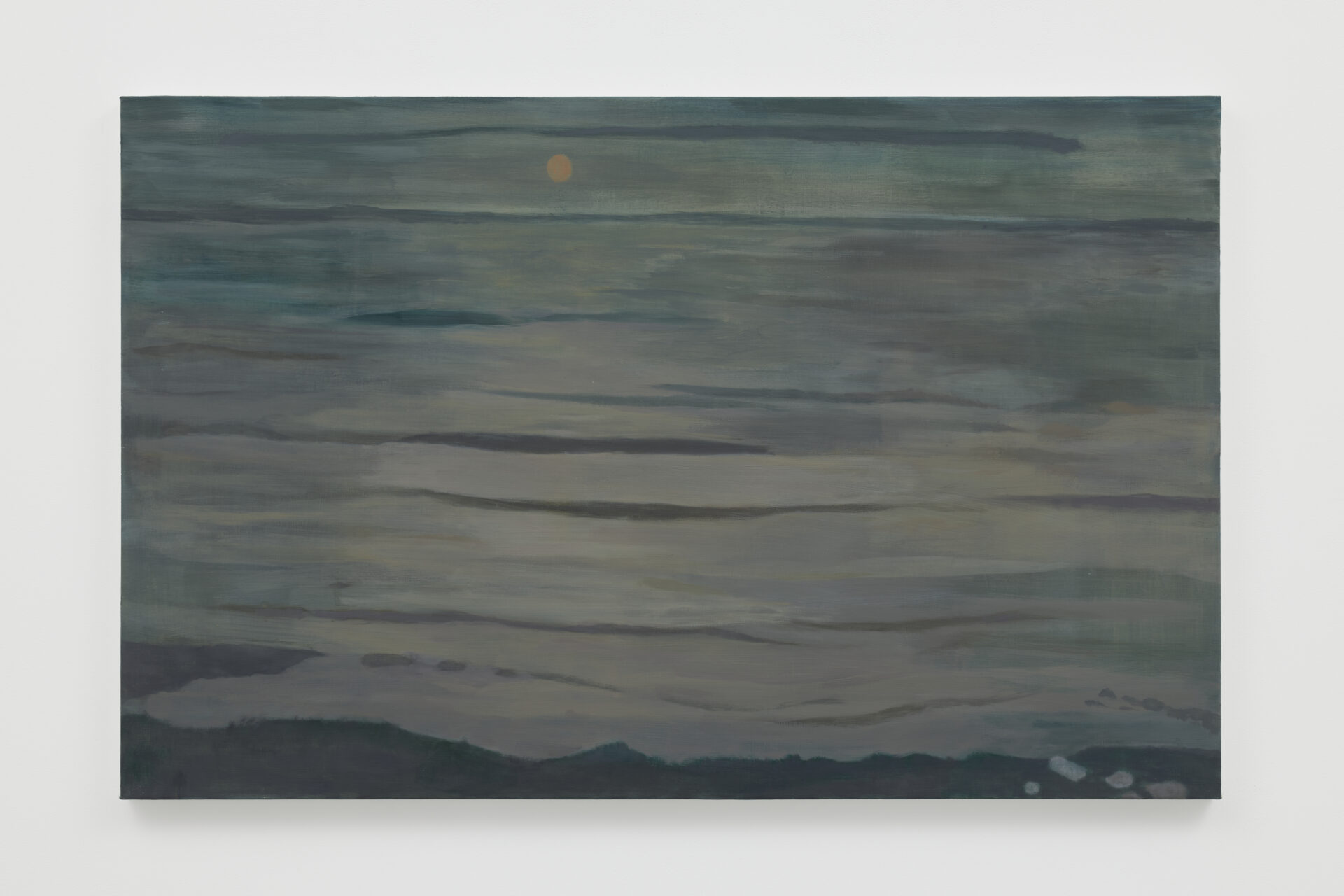
中村翔大「Still life with Glasses」2025年、キャンバスに油彩、95 x 155 cm. ©︎ Shota Nakamura Photo: Kenji Takahashi
Shota Nakamura “Still life with Glasses” 2025, oil on canvas, 95 x 155 cm. ©︎ Shota Nakamura Photo: Kenji Takahashi
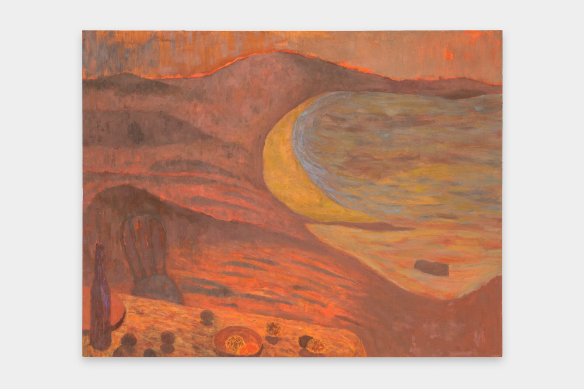
中村翔大「Seashore」2025年、キャンバスに油彩、91.1 x 142.8 cm. ©︎ Shota Nakamura Photo: Kenji Takahashi
Shota Nakamura “Seashore" 2025, oil on canvas, 91.1 x 142.8 cm. ©︎ Shota Nakamura Photo: Kenji Takahashi
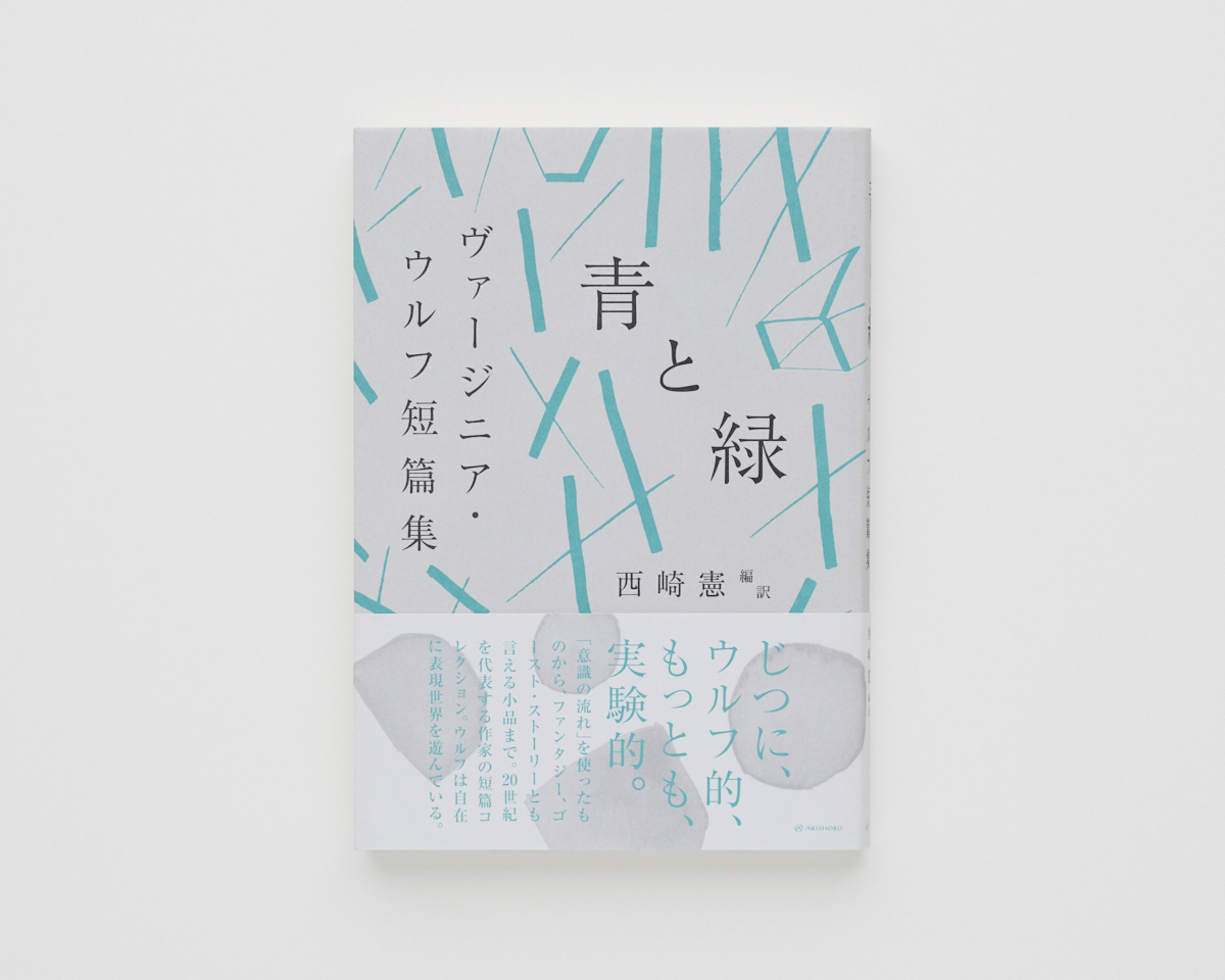
Photo: Kenji Takahashi
Photo: Kenji Takahashi
鈴木 『灯台へ』でも、灯台そのものについて、あるいはそこへ向かう理由はほとんど語られません。中心の不在はボナールの話でも出てきましたが、中心が宙吊りになっていても、記述の連続によって周辺から作品が成立していくというあり方ですね。
中村 言葉はすごくガイドになります。今の日本の作家では柴崎友香さんの言葉はとても淡々とした、どこかカメラのような描写が非常に印象的です。最近では『帰れない探偵』、それからピーター・ドイグの絵が表紙になっている『遠くまで歩く』という小説が今年に出版されました。柴崎さんは記憶、そして街の歩行というものをメインに扱っている作家だなと思うんです。歩行の状態ってなんだろう、ということを僕もすごく考えていて、絵を描くうえでルートをどういう風に設計するか——目的地を明確に設定したうえでそれに向かってリニアな道のように描くのか、それとも散歩のように脱線を繰り返しながら進むように描くのか——どちらが理想的な環境なのかと考えたときに、僕はやはり直線的ではなく、紆余曲折を経て終着点に達したいと思うんです。 レベッカ・ソルニットという作家の著書に『Wanderlust: A History of Walking 』(邦題『ウォークス 歩くことの精神史』)というタイトルの、歩行がもたらす精神とその歴史を扱ったエッセイがあります。それを読んで以来、制作の手順やその時間を思考する際に歩行とパラレルに捉えるようになりました。
KS In Woolf’s To the Lighthouse, almost nothing is said about the lighthouse itself or the reason for going there. Like you said about Bonnard, the center is left ambiguous, but the work coheres at the edges through continuous description of things.
SN Language is an important guide for me. Among Japanese writers today, I’m especially taken with Tomoka Shibasaki. Her writing has a matter-of-fact, almost photographic quality. Recently she published Kaerenai Tantei, and also Tōku made Aruku, which has a Peter Doig painting on the cover. She often writes about memory and about walking in cities. I think a lot about what it means to walk, and as an analogy to that, how to determine a route in painting. Do you set a clear destination and head straight toward it, or do you wander as if on a stroll, taking detours along the way? For me, the ideal is not a straight line but reaching the end through twists and turns. There’s also Rebecca Solnit’s essay “Wanderlust: A History of Walking,” which explores the spirit and history of walking. Since reading it, I’ve been thinking of the process of painting and the time spent on it as parallel to walking.
鈴木 逸脱と思考のための歩行——移動とは「予期せぬものを待つこと」です。今回は水彩画も初めて発表されましたが、外と内との関係が非常に曖昧な作品が多いですね。あとは白、あるいは空白も印象的です。それから「オリエント」というタイトルなど、さまざまなレイヤーがありますね。
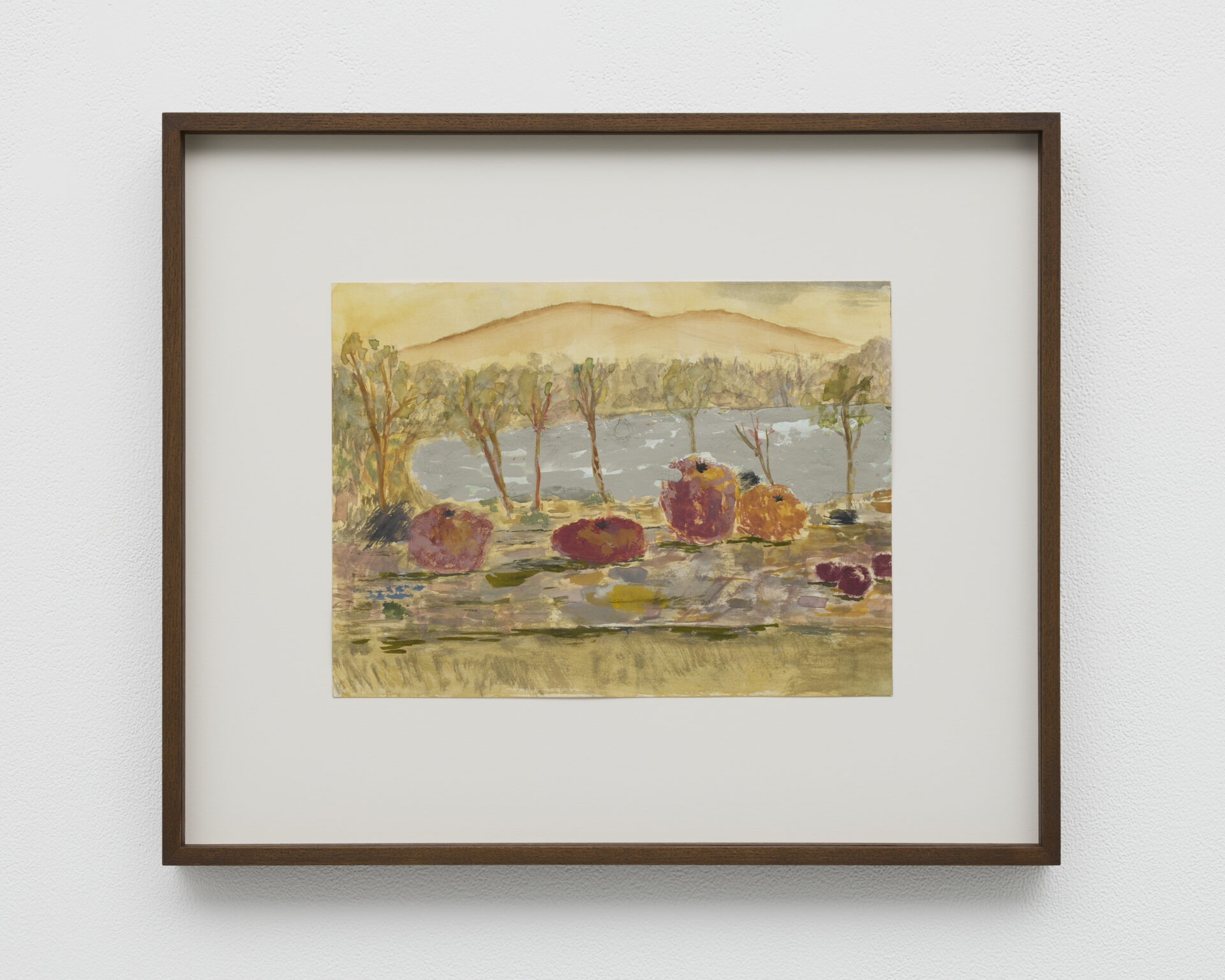
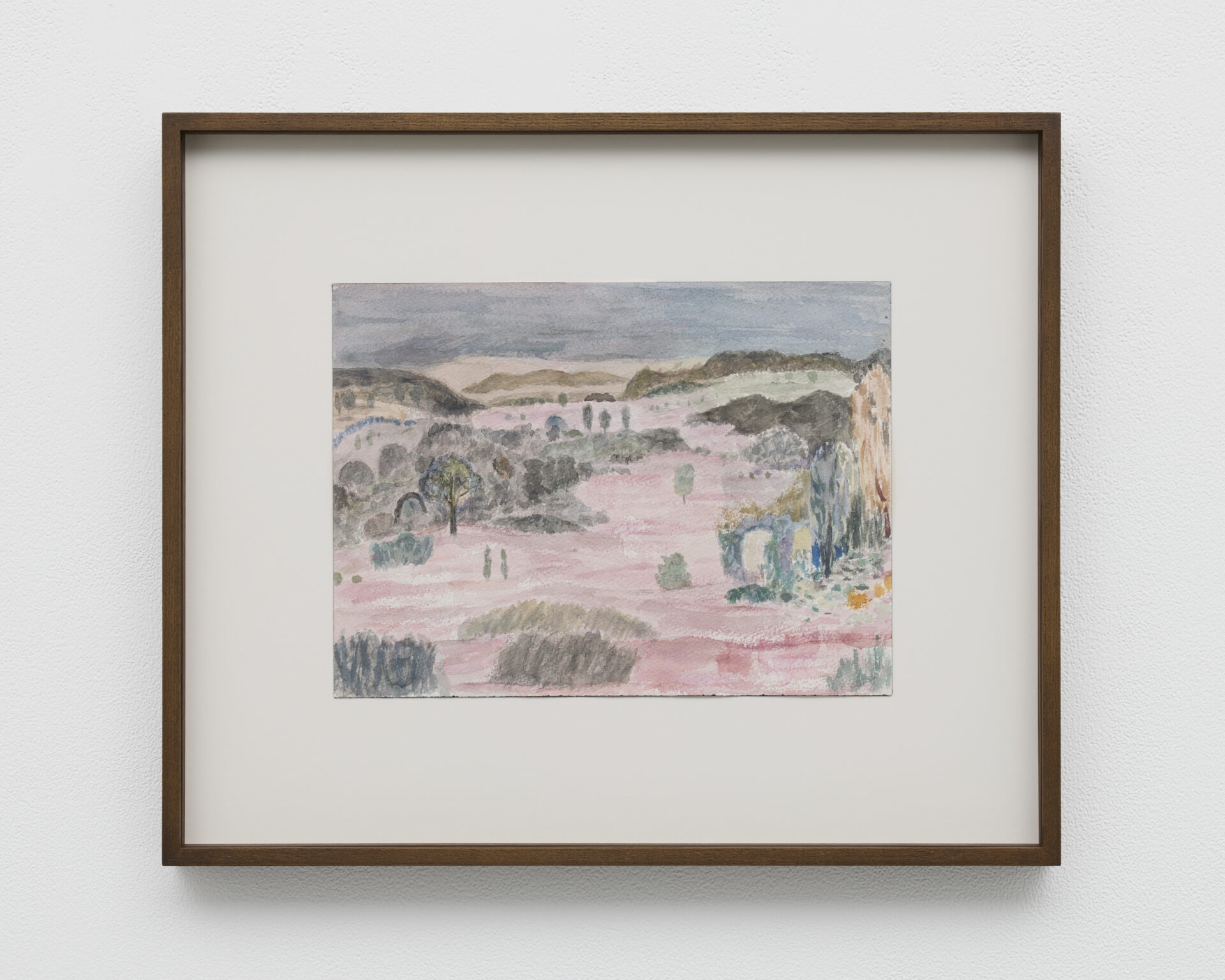
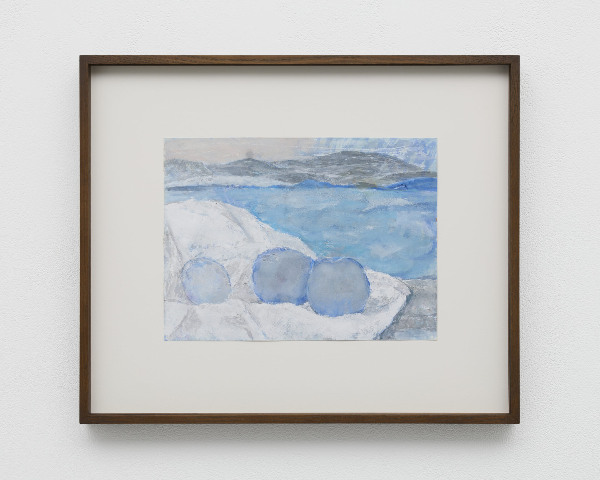
中村 今回の水彩の作品は、すべて同じフォーマットの横位置で制作しています。そのフォーマットに限定したのは、自分の意識を観客に共有できるようにしたかったからです。紙そのものが「窓」のような役割を果たす——そういった意識です。その「窓」というフレームの中で、静物と風景のイメージが立ち現れる、または静物と風景が混ざり合うような感覚を作りたかった。その感覚をより明確にするために、あえて統一したフォーマットを選びました。風景のイメージは、自分が旅行したときにiPhoneや自分のカメラで撮影した風景写真をベースにしていて、今回の「オリエント」に描かれてる風景はすべて移動する車や電車の窓から見える風景です。 先ほども触れましたが、主題を決定的に「これだ」と決めることがやはり昔からよく分からなくて。すべてが同じように、同時に窓のフレームに切り取られ、流れていく、そんな状態に魅かれます。窓の向こうの風景は「どの瞬間を選んでもいい」と気づかせてくれる。そんなことから窓の風景を選びました。
鈴木 構築的な油彩に対して、横位置のフレーミングで統一された水彩はより映像的です。流れていく意識や風景というのは、先ほどのウルフや散歩の話ともつながりますね。窓辺は、ニース時代のマティスも好んだモティーフです。水彩は短時間で描かれるのですか?
中村 水彩も実は時間のかかる制作です。キャンバスに向かうときは自分の身体と対峙するように描きますが、紙に描くときは水平に置いたテーブルの上から眺めるようにして、染みをつくっていく感覚があります。水彩の顔料は不安定で揺らぎやすく、透明なため、複数のレイヤーを重ねることができます。そのレイヤーの蓄積や染みの重なりからイメージを起こしたりして、変化していく感覚にとてもわくわくします。また、水彩というメディアは、顔料の定着は儚く、すぐに失われてしまう弱さがありますが、その特性をむしろ好ましく感じています。ですから今回、水彩作品を発表できたのはとても嬉しいことでした。これまで発表を前提とせずに制作してきました。本当にスタディとも呼びたくない、ただ楽しんでやってきました。
鈴木 もっと個人的なもの。
中村 そうですね。
KS Walking can be a way of getting away from everything and thinking, a kind of expecting the unexpected. This time you’re also showing watercolors for the first time, many of which blur the boundary between interior and exterior. The use of white or blank space is striking too. And then exhibition title is Orient, which add further layers.
SN All of these watercolors are in the same horizontal format. I limited myself to that because I wanted the viewer to share in my way of seeing. I think of the paper itself as a window. Within the frame of that window, I wanted to produce a sense of still life and landscape emerging or blending together. To clarify that feeling, I made a deliberate decision to work in a consistent format. The landscapes are based on photos I took while traveling, with either my phone or my camera. Every landscape in the Orient series is a view from the window of a moving car or train. As I said, I’ve never been able to pin down a subject and say, this is it. What I’m drawn to is that state where everything is framed equally by the window, and it’s all flowing past. Looking as if through a window made me realize that any moment was as good as any other. That’s why I chose to focus on landscapes through windows.
KS Compared with the more structured oil paintings, the watercolors in a unified horizontal format feel more cinematic. The flowing landscapes and shifting mental state resonate with what we said earlier about Woolf and with walking. The window was also a favorite motif for Matisse in Nice. When you paint watercolors, do you work quickly?
SN Watercolors actually take a lot of time too. When I paint on canvas it feels like confronting my own body, but with paper, I lay it on a table, look down at the surface, and build it up through staining. Watercolor pigments are unstable and easily disturbed, and because they’re transparent I can layer them again and again. I’m excited by the changes that occur when those layers accumulate and the staining overlaps to form images. Watercolor is fragile in that the pigments don’t hold and they fade quickly, but I actually find that quality appealing. So, I was very glad to be able to show watercolors this time. I’ve never painted them with the idea of exhibiting them. I don’t even want to call them studies, I’ve simply enjoyed making them.
KS So they’re more personal.
SN That’s right.
中村翔大「Untitled」2025年、紙にアクリル、ガッシュ、鉛筆、23 x 31 cm. ©︎ Shota Nakamura Photo: Kenji Takahashi
Shota Nakamura “Untitled” 2025, watercolor, gouache, and pencil on paper, 23 x 31 cm. ©︎ Shota Nakamura Photo: Kenji Takahashi
中村翔大「Untitled」2024-25年、紙にアクリルとガッシュ、23 x 31 cm. ©︎ Shota Nakamura Photo: Kenji Takahashi
Shota Nakamura “Untitled” 2024-25, watercolor and gouache on paper, 23 x 31 cm. ©︎ Shota Nakamura Photo: Kenji Takahashi
中村翔大「Untitled」2024-25年、紙にアクリルと鉛筆、23 x 31 cm. ©︎ Shota Nakamura Photo: Kenji Takahashi
Shota Nakamura “Untitled” 2024-25, watercolor and pencil on paper, 23 x 31 cm. ©︎ Shota Nakamura Photo: Kenji Takahashi
鈴木 中村さんの水彩は移動や旅と結びついていますが、旅の記憶をどうやってとどめていますか。写真? スケッチ? 日記?
中村 スケッチよりは写真が多いですね。あと日記、テキストも旅行の後に携帯で書きます。デジタルで処理するのが好きです。最近は「言葉とイメージ」の関係を自分の言語で切り出す練習として、旅行の後は日記を書いています。
鈴木 油彩に戻って、中村さんがよく描くいわゆる室内画を見てみましょうか。19世紀の中産階級の女性たちは「家庭の天使」と呼ばれ、必ずしも外で働く存在ではありませんでした。マネやモリゾの絵画が、彼女たちが「閉じ込められて」いた室内でも、あるいは屋外でもない、ベランダという境界の女性たちを描いたのは重要で、室内画がこのような親密さと背中合わせの政治性も孕んでいたことを前置きしつつ、移民としての葛藤を抱えながらヨーロッパに暮らす中村さんの室内画を一緒に見たいと思います。 中村さんの近作の室内画を見ると、たとえば《Flowers on the table》、《Untitled (Kantha)》、《Window(dusk)》で、それぞれ全く異なった時間・空間の感覚があり、それぞれの絵画で試されている中村さんの関心も全く異なっているように見えます。今回の新作の油彩のうち3点の室内画にも、非常に強いイメージの喚起力がありますね。初めて中村さんの作品を観る人はなにか物語を読み解きたくなると思うのですけれど、ご本人としては物語性を排している?
KS Your watercolors are connected to movement and travel. How do you preserve memories of your travels? With photographs, sketches, or diaries?
Nakamura Not so much with sketches, mostly photos. I also keep a diary, writing notes on my phone after trips. I like processing things digitally. Recently I’ve been writing travel diaries as a way to practice putting the relationship of words and images into my own language.
KS Coming back to oil painting, let’s look at the interiors you often paint. In the 19th century middle-class women were idealized as “angels in the house” and were not expected to work outside the home. That’s why it was significant when Manet and Morisot painted women on verandas, liminal spaces that were neither the interiors where they were confined nor fully outside. Interiors were intimate, but they could also have political implications. With that in mind, and thinking of your own experience of living in Europe while dealing with the complexities of being an immigrant, I’d like to see your interior paintings. Works like Flowers on the table, Untitled (Kantha), and Window (Dusk) each convey completely different senses of time and space, and your concerns and explorations in each also seem very different. In your new oils, the three interiors are particularly evocative. For someone seeing your work for the first time, it compels them to read a story into them, but do you deliberately avoid narrative?
中村 そうですね。部分の選択が事後的に絵となり、物語を作るのかな。むしろ、その偶然性を自分自身が楽しんでいるところが大きいんじゃないかと感じています。理想としては、まったくなにも分からない状態で描き始めたときに、結果として木のイメージが立ち上がる——そんな物語が理想的だなと思います。でも実際には、なにも考えずに描き始めて木のイメージが自然に現れるというのは、やはり神話にすぎないと思います。むしろ木を描こうと思ったときに木の線を描いていたら木じゃなくなっていくとか、木の前になにか人を描き始めてそこから広がっていくアプローチの方が面白いなと思っています。
SN Yes. I think narrative comes afterward, once some parts of the painting have been determined. What I really enjoy is that sense of randomness. Ideally I’d love to start painting without any plan at all and have something like the image of a tree emerge. But I think it’s a myth, the idea that you can just paint without thinking and an image will naturally appear. What interests me more is when I set out to paint a tree, but as I draw the lines for it, it stops being a tree, or when I start sketching a figure in front of the tree and the painting develops from there. That kind of approach is more exciting to me.
中村翔大「無題」2025年、キャンバスに油彩、127.5 x 82.2 cm. ©︎ Shota Nakamura Photo: Kenji Takahashi
Shota Nakamura “Untitled” 2025, oil on canvas, 127.5 x 82.2 cm. ©︎ Shota Nakamura Photo: Kenji Takahashi
鈴木 新作の果物の絵画は日本の洋画を想起させます。他のインタビューで、児島善三郎や高橋由一について語っていらっしゃるのを見ましたが、もともと洋画にはご関心があったのでしょうか? 中村さんのようなディアスポラとは言えませんが、児島もパリで活動した時期がありました。
KS Your new fruit painting brings to mind Yōga (Japanese Western-style painting). note2 In other interviews you’ve talked about the modern Japanese painters Zenzaburo Kojima and Yuichi Takahashi. Have you always been interested in Yōga? Kojima was also based in Paris for a time, though not as part of a diaspora like you.
中村翔大「Still life with Apples」2025年、キャンバスに油彩、55 x 65 cm. ©︎ Shota Nakamura Photo: Kenji Takahashi
Shota Nakamura “Still life with Apples” 2025, oil on canvas, 55 x 65 cm. ©︎ Shota Nakamura Photo: Kenji Takahashi
中村 世界中の近現代の絵画を観るとき、いつも「面白い絵とはなにか」という、制作における最初の大切な出発点を考えます。日本の近代絵画では、西洋化していること、あるいは西洋的であることが評価の基準のひとつになっていたと思います。けれど、いまあらためて日本近代の洋画を観ると、従来の日本絵画が持っていた遠近法や主題の表現方法と、輸入された視覚言語が混ざり合い、当時は未熟あるいは下手と見なされた処理のなかに、かえって絵画としての面白さを感じるのです。そこには奇妙なローカル性が表れている。そのことに気づいてから、日本の近代絵画を積極的に観るようになりました。もちろん、児島善三郎さんの作品は参考にしていますが、ほかには熊谷守一さんの作品をよく観ます。両者とも目前の景色=日本の風景から出発し、西洋の様式や油絵を参照しながら、自分なりの絵画に縫い合わせていくその作業に関心があります。
SN Whenever I look at modern and contemporary painting from anywhere in the world, my first question is always, what makes this painting interesting? That’s the first step in making work. In modern Japanese painting, being Westernized or adopting a Western style was one of the benchmarks for evaluation. But looking at modern Yōga now, I find the parts once dismissed as clumsy or immature much more compelling, the way traditional Japanese modes of perspective or subject matter mixed with imported visual vocabulary. That mix produces a strange kind of locality. Once I noticed that, I began actively seeking out Japanese modern painting. I do study Zenzaburo Kojima, but I also look a lot at Morikazu Kumagai. I’m drawn to the way both of them began with what was in front of them, which was Japanese scenery, and while referencing Western styles and oil painting, they stitched those elements together into their own kind of painting.
中村翔大「Flowers」2025年、キャンバスに油彩、55 x 65 cm. ©︎ Shota Nakamura Photo: Kenji Takahashi
Shota Nakamura “Flowers” 2025, oil on canvas, 55 x 65 cm. ©︎ Shota Nakamura Photo: Kenji Takahashi
鈴木 日本の風景と映画から始まったインタビューなので、映画の話で終わりましょうか。アニエス・ヴァルダの『幸福』を下敷きにした作品や、キアロスタミの作品がベースになっている作品もありますね。最近観た映画があれば最後に教えてください。
中村 映画は本当にいろいろ観ています。先週は宮崎駿の『君たちはどう生きるか』をあらためて観直しました。僕は昔から宮崎駿の作品がとても好きですが、『君たちはどう生きるか』は特別に感じています。これまでの作品の中でも背景の描写が最も細かく、映画の進行はさまざまな場所への移動と並行しています。鮮やかでハッとする風景が通り過ぎていくなかで、物語はその風景を追うような構造になっていて、そこが非常に面白いと感じます。また、アピチャッポン・ウィーラセタクンの『メモリア』も再び観ました。彼の作品は昔からよく観ているのですが、死者、窓、森、時間、そして時間を超越した空間といった彼の作品に一貫してあらわれるエレメントがとくに好きです。
鈴木 ありがとうございました。
KS Since we started this interview by talking about Japanese landscape and film, let’s end with film as well. You’ve made works inspired by Agnès Varda’s Le Bonheur and others based on films by Abbas Kiarostami. Have you seen any films recently?
SN I really watch everything, all kinds of movies. Just last week I re-watched Hayao Miyazaki’s The Boy and the Heron. I’ve always loved his work, but this film feels especially meaningful to me. The backgrounds are more detailed than in any of his earlier films, and the story moves through a series of places with stunning landscapes flowing by. The narrative seems to develop in pursuit of those landscapes, which I found fascinating. I also watched Apichatpong Weerasethakul’s Memoria again. I’ve been watching his films for many years, and what I love is how the same elements recur. Death, windows, forests, time, and spaces that feel outside of time.
KS Thank you very much for this conversation.
Note
| 1. | Olamiju Fajemisin, “Garden of Dreams,” Small Works 2022–24, Triangle Books, 2025. back |
| 2. | In the Meiji era (1868–1912), with the introduction of Yōga (Western-style painting) such as oil painting from the West, traditional Japanese painting came to be called Nihonga. In 1876, the Meiji government established Kōbu Bijutsu Gakko (the School of Arts and Technology) to implement Yōga education and encouraged Western painting methods. In response, however, Tenshin Okakura and others advocated the revival of traditional Japanese art and in 1887 founded the Tokyo Fine Arts School (present-day Tokyo University of the Arts). At the time of its opening, it excluded Yōga and had only a Nihonga department. In 1907, both Nihonga and Yōga divisions were established at the Bunten (Ministry of Education Art Exhibition), and the two became recognized as parallel genres, standing in opposition while also influencing each other. back |
インタビュー構成:鈴木幸太
編集:新田京子
翻訳:クリストファー・スティヴンズ
Interview: Kota Suzuki
Editor: Kyoko Nitta
Translation: Christopher Stephens
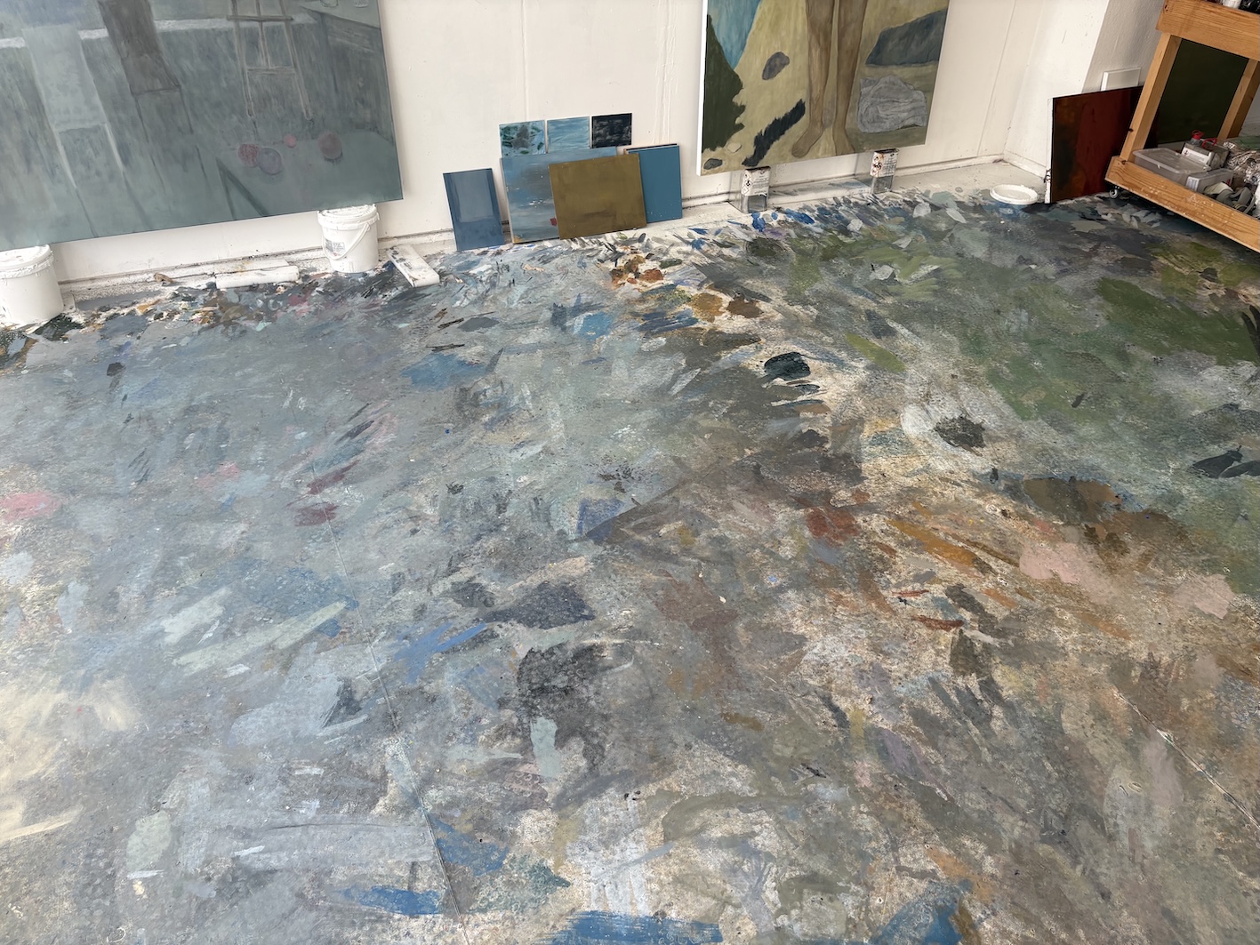
中村の制作の起点となるのは、自身の記憶、観察、そして絵画や映画、写真など多岐にわたるイメージのリサーチです。それらのイメージを編集し再構成することで生まれる作品では、風景、人物、静物といった主題が扱われます。屋外の庭や風景と室内の境目が溶け合うようなイメージや、内省的な空気を纏う人物の姿は、中村作品に特徴的ともいえる没入的な情景を生み出します。ピエール・ボナール(1867-1947)らの影響に言及しながらこれまで色彩豊かな作品を発表してきた中村ですが、近年は色のトーナリティについて思索しています。隣接する色によって色相が変化して見える「グレー」の繊細さへの関心を反映するように、個展「青と緑」(タカ・イシイギャラリー京橋、2025年)で発表された最新のペインティングはグレーやベージュといった抑制されたトーンの中で展開されます。またこれまでの作品では重層的で厚みのある画面づくりがおこなわれていましたが、近作では油絵具に透明性をもたせて色のレイヤーをつくり出すという、水彩表現に通じる実践が試みられています。水のある風景というモチーフ選択や、水彩の制作との相互作用で生まれる表現——これらは、水や流動的性質が中村の世界を構成する重要な要素として存在していることを示しています。
中村はこれまでも水彩での制作に取り組んできましたが、個展「オリエント」(タカ・イシイギャラリー京橋、2025年)は、紙作品を発表する初の機会となります。サイズを統一した紙作品が並ぶ本展は、中村がイメージの原点とするもの—車窓からの風景—の特質が大きく反映されているといえるでしょう。会場で作品を追うごとに異なる風景が現れる様子は、車中から窓越しに見る風景の移り変わりを思わせます。キャンバスあるいは紙はそれ自身が別の世界への窓のような役割を果たしていると考える中村は、紙作品のサイズを固定したのはイメージの生起条件としての紙(フレーム)をより強調するためであったと語ります。水という媒体の流動性に関心を寄せる中村は、水彩絵具がつくりだす「しみ」から画面が立ち上がる感覚に注目します。また変幻自在でコントロールが容易でない水彩の性質は、移動する車窓から見える風景の「定まらなさ」に通ずるものがあるかもしれません。この流動性や偶然性、あるいは透明性を生かす実践は、京橋会場で発表するペインティングの表現と相互的影響を生み出しています。
Nakamura’s practice begins with his own memories, observations, and research into diverse imagery derived from paintings, films, photographs, and other sources. He edits and reconstructs these images in compositions that take the form of landscapes, figures, and still life arrangements. Scenes in which the boundaries between gardens or landscapes and interiors seem to dissolve, and figures that convey quiet introspection, are imbued with the immersive atmosphere that characterizes Nakamura’s work.
While his earlier works featured a rich, vibrant color palette referencing influences such as Pierre Bonnard (1867–1947), Nakamura has recently turned his attention to chromatic tonalities. Reflecting his interest in the subtle nuances of gray, which appears to shift its hue depending on the surrounding colors, the latest paintings in the exhibition “Blue and Green” at Taka Ishii Gallery Kyobashi are executed in subdued tones such as gray and beige. In contrast to the heavily layered surfaces of his past works, the recent paintings adopt an approach akin to watercolor, building up layers of color with translucent oil paint. Nakamura’s exploration of aquatic landscapes, and his ongoing dialogue between the media of oil and watercolor, point to water and its fluid qualities as essential elements that shape the artist’s visual world.
Although Nakamura has previously worked in watercolor, A solo exhibition“Orient” at Taka Ishii Gallery Roppongi is his first time exhibiting a cohesive series of works on paper. Featuring a series of identically sized works, it explores the theme of landscapes seen from the window of a moving car, which form the wellspring of Nakamura’s imagery. As viewers move through the space, the sequence of changing scenes evokes the shifting views glimpsed from a car in motion. For Nakamura, a canvas or sheet of paper serves as a kind of window onto another world. He explains that standardizing the dimensions of the paper is a means of emphasizing the paper (or frame) as a structure that determines how his imagery emerges.
Drawn to the fluidity of water-based media, Nakamura focuses on the sensation of images emerging from watercolor stains. The medium’s ever-shifting, control-resistant nature seems to echo the ephemerality of scenery seen from a moving car. Nakamura’s embrace of fluidity, chance, and transparency resonates with the painterly approach in his works at the Kyobashi venue.
中村翔大「オリエント」
—
[会期] 2025年10月4日[土] –11月1日[土]
[会場] タカ・イシイギャラリー 六本木
[URL] https://www.takaishiigallery.com/jp/archives/35186/
オープニング・レセプション:10月4日[土]17:00 – 19:00
中村翔大「青と緑」
—
[会期] 2025年10月4日[土] – 11月1日[土]
[会場] タカ・イシイギャラリー 京橋
Shota Nakamura “Orient“
—
[Date] Oct 4 – Nov 1, 2025
[Venue] Taka Ishii Gallery Roppongi
[URL] https://www.takaishiigallery.com/en/archives/40880/
Shota Nakamura “Blue and Green“
—
[Date] Oct 4 – Nov 1, 2025
[Venue] Taka Ishii Gallery Kyobashi
Opening reception: Saturday, Oct 4, 17:00 – 19:00
Photo: Jordan Weitzman
Photo: Jordan Weitzman
中村翔大
1987年山梨県生まれ
現在、ベルリンを拠点に活動
—
2011年に武蔵野美術大学を卒業、現在ベルリンを拠点に活動。主な個展に「SIGHS」C L E A R I N G(ニューヨーク、2025年)、「small works 2022-2024」C L E A R I N G(ロサンゼルス、2024年)、「light room」C L E A R I N G(ロサンゼルス、2023年)、「each passing day」Peres Projects(ベルリン、2022年)、「Walking」Ilwoo Space(ソウル、2021年) などがある。主なグループ展に、「Aura Within」Hauser & Wirth(香港、2025年)、「Wings of a Butterfly」Ingleby Gallery(エディンバラ、2025年)、「Meet me by the lake」C L E A R I N G(ニューヨーク、2024年)、「BERNHEIM x ADZ Gallery」Bernheim(チューリッヒ、2024年)、Male Nudes: a salon from 1800 to 2021」Mendes Wood DM(サンパウロ、2021年)など。作品は、ICAマイアミ、オレンジカウンティ美術館(コスタメサ)、Lafayette Anticipations – Fondation d’entreprise Galeries Lafayette(パリ)などに収蔵されている。
Shota Nakamura
Born in 1987 in Yamanashi
Currently lives and works in Berlin.
—
Nakamura graduated from Musashino Art University in 2011. His solo exhibitions include “SIGHS”, C L E A R I N G (New York, 2025); “small works 2022-2024”, C L E A R I N G (Los Angeles, 2024); “light room”, C L E A R I N G (Los Angeles, 2023); “each passing day”, Peres Projects (Berlin, 2022); “Walking”, Ilwoo Space (Seoul, 2021). He has participated in group exhibitions such as “Aura Within”, Hauser & Wirth (Hong Kong, 2025); “Wings of a Butterfly”, Ingleby Gallery (Edinburgh, 2025); “Meet me by the lake”, C L E A R I N G (New York, 2024); “BERNHEIM x ADZ Gallery”, Bernheim (Zurich, 2024); “Male Nudes: a salon from 1800 to 2021”, Mendes Wood DM (São Paulo, 2021). Nakamura’s works are included in the collections of ICA Miami; Orange County Museum of Art (Costa Mesa); Lafayette Anticipations – Fondation d’entreprise Galeries Lafayette (Paris).
鈴木幸太
—
ポーラ美術振興財団 ポーラ美術館主任学芸員。森美術館での学芸部アシスタントを経て、2012 年より仏系企業財団の文化事業に従事。映画プログラムと、国内外の作家の展覧会を担当。2018年より現職。ポーラ美術館での主な企画展として、「シンコペーション:世紀の巨匠たちと現代アート」(2019年)、「モネ―光のなかに」(2021年、会場構成:中山英之)のほか、ケリス・ウィン・エヴァンス、ロニ・ホーン、フィリップ・パレーノらの個展を企画。
Kota Suzuki
—
Senior Curator, Pola Museum of Art, Pola Art Foundation. Previously served as Curatorial Assistant at the Mori Art Museum before working with a French corporate foundation from 2012, where he coordinated cinema programs and international exhibitions. Since 2018, he has curated major exhibitions at the Pola Museum of Art, including “Syncopation: Contemporary Encounters with the Modern Masters” (2019), “Monet: In The Light” (exhibition design by Hideyuki Nakayama, 2021), and solo shows by Cerith Wyn Evans (2020), Roni Horn (2021), and Philippe Parreno (2024).